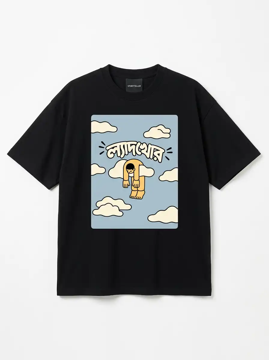
Bengali typography design is the most underused tool in Indian streetwear. Global brands spend fortunes developing custom Latin typefaces, while a script with more visual personality than most of them sits largely unexplored on clothing.
Here is what makes Bengali script structurally different, and why that difference is a gift to anyone designing a t-shirt.
The Matra Line Changes Everything
Latin letters sit on a baseline. Bengali letters hang from one — the matra, a horizontal stroke running along the top of most characters and connecting them into a continuous rail.
For a designer this is enormously useful. That top line gives you a built-in horizontal anchor, so Bengali text reads as a unified block rather than a row of separate shapes. On a chest print, where you need a graphic to hold together as one mark, that is exactly the behaviour you want.
Curves Latin Simply Does Not Have
Below the matra, Bengali opens into loops, hooks and bowls with far more variation than the Latin alphabet offers. Characters carry genuine asymmetry.
The practical result is that a short Bengali phrase fills space more interestingly than the same phrase in English. Where English needs decorative treatment to look like artwork, Bengali arrives that way.
Conjuncts: The Hard Part
Bengali combines consonants into conjunct characters — new stacked forms that are not simply two letters pushed together. There are hundreds, and they are where careless design falls apart.
Stretch a Bengali font to fit a layout and the conjuncts distort first, producing letterforms that are subtly wrong in a way native readers notice immediately. Never scale Bengali non-proportionally. If a phrase does not fit, change the phrase or the composition, not the letter shapes.
Why So Few Brands Get It Right
Most design tooling was built Latin-first. Kerning controls, variable-font support and layout engines all assume a baseline, and Indic script support has historically been an afterthought.
Unicode support for Bengali has existed for decades and rendering has improved substantially, but the design culture lagged — the reference material, the type specimens, the habit of treating the script seriously. That gap is the opportunity.
Rules for Setting Bengali on a Tee
Scale proportionally. Never stretch on one axis.
Give the matra room. Crowding the top line makes the whole block feel compressed.
Keep phrases short. Three to five words reads across a room; a sentence does not.
Test at real size. What looks elegant at 200% on screen can turn muddy at print size.
Respect the weight. Bengali carries more ink than Latin at the same point size, so it needs more surrounding space, not less.
Legibility Is the Whole Job
A Bengali print that cannot be read at conversational distance has failed, however beautiful it looks flat on a table. Test every design at three metres before approving it.
Print durability matters for the same reason. Cracking destroys letterforms faster than it destroys images, because a broken stroke can turn one character into another — which is why our care guide matters more for typography pieces than for illustrated ones.
A Script Worth Designing For
Bengali is written by well over 200 million people and has a modern typographic history stretching back to the first types cut in the eighteenth century. It is not an exotic flourish to be borrowed — it is a mature writing system with its own rules.
Design it properly and it rewards you. Treat it as decoration and native readers will know within a second.
See It Done Properly
Every typography piece we make is set by hand rather than stretched to fit. Browse the collection, and tag #storyteller_india when you wear one — we repost our favourites on Instagram.